Sea surface temperature charts show you the ocean's thermal structure before you run a mile. Learn to identify the breaks, eddies, and upwellings that concentrate baitfish and pelagic predators, match those features to species-specific temperature ranges, and layer in chlorophyll and altimetry data to build a high-confidence plan the night before your trip.
Reading SST Charts to Find Offshore Gamefish
You've done it. You ran 60 miles, spent the fuel, put in the time, and found a big blank stretch of blue water. The birds weren't working. The flotsam line was empty. Nothing on the meter. You picked a direction and ran another 20 miles chasing a hunch. Still nothing. Then on the way back in, someone running a different direction put a yellowfin tuna on the dock that weighed 180 pounds.
They weren't luckier than you. They were reading the ocean before they left the marina.
Sea surface temperature charts change that equation. They let you look at a map of the water's thermal structure before you ever fire the engines. Temperature breaks, warm eddies, cold upwellings: these are the features that concentrate baitfish, and where bait concentrates, gamefish follow. SST data used to be something only commercial fleets and tournament teams with big budgets could access. Now it's on your phone. What separates the captains who use it well from the ones who just look at pretty colors is knowing what they're actually seeing.
That's what this article is about.
What Is a Sea Surface Temperature Chart?
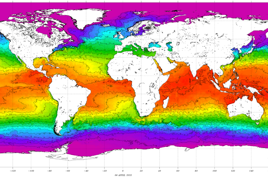
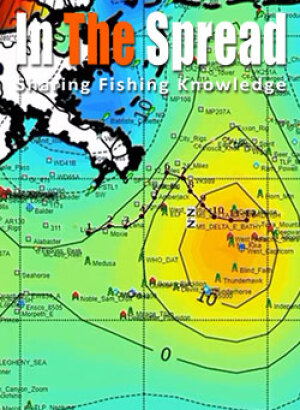
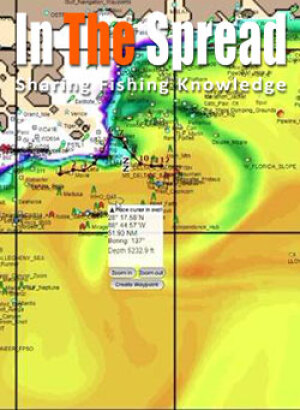
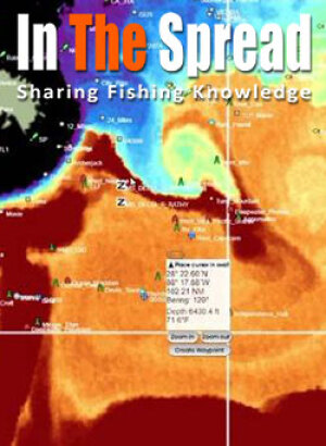
An SST chart is a satellite image that shows the temperature of the ocean's top layer, color-coded so you can read the thermal landscape at a glance. Satellites pass overhead and measure infrared radiation coming off the water's surface. That radiation data gets processed into temperature readings, then rendered as a continuous color gradient across the image.
- Dark blues and purples represent the coldest water, typically below 50°F
- Light blues and teals show cool water running 50 to 65°F
- Greens and yellows land in the moderate range, around 65 to 75°F
- Oranges and reds indicate warm water from 75 to 85°F
- White or pink shading means you're looking at surface temps above 85°F
What's the Difference Between Infrared and Microwave SST Data?
Two satellite sensor types produce the SST data you'll see on fishing platforms, and knowing the tradeoff helps you evaluate what you're looking at.
Infrared radiometers measure the skin-level temperature of the ocean surface with excellent resolution. The images are sharp, features are well-defined, and temperature gradients read clearly. The problem is clouds. Infrared sensors cannot see through cloud cover at all, which means any area under overcast skies shows up as a data gap or gets filled with composite imagery from a different day.
Microwave radiometers solve the cloud problem. They can read ocean temperature right through cloud cover, so you get consistent data even when the sky is socked in. The tradeoff is lower resolution. Features that look crisp on an infrared image may appear softer and less defined on a microwave product.
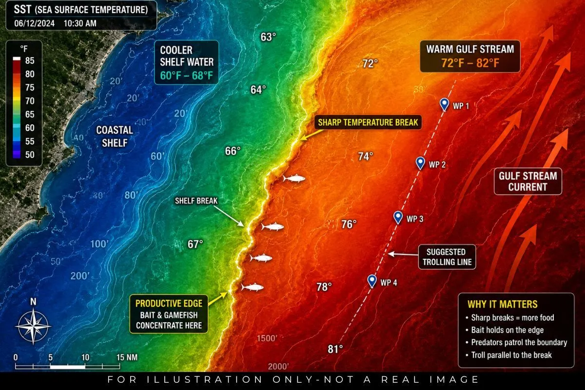
Why Temperature Breaks Are Where the Fish Are
The ocean looks uniform from the surface. Offshore, blue water in every direction can feel like a coin flip. What you can't see from the boat is that you're looking at a mosaic of different water masses, each with distinct temperatures, salinities, and densities. When those masses push up against each other, you get a thermal boundary, and that boundary is where offshore fishing consistently produces.
The biology is straightforward. Plankton doesn't drift randomly. It blooms where conditions are right, specifically where nutrients and sunlight converge. Temperature breaks often occur where current systems collide, and those collisions mix nutrient-rich water from depth into the surface layer. Plankton blooms. Small baitfish show up to feed. Larger baitfish follow. Then the predators arrive, and they stay because the food keeps coming.
That's why a captain who sees a sharp edge on an SST chart gets excited. It's not just about temperature preference. It's about understanding that the edge is probably producing food, and food is what keeps fish in an area.
How to Identify the Features That Hold Fish
Edge Breaks, Gradient Breaks, and Fingers: Which One Matters Most?
Not every temperature break is created equal. An edge break is the sharpest type, appearing as a hard line on the chart where one color zone ends and another begins cleanly. These mark actual water mass boundaries and are usually your highest-value targets. A gradient break is softer, fading across several miles rather than cutting sharply. Gradients can still hold fish, but they're less defined and usually less productive than a hard edge.
What Is a Convergence Zone and Why Does It Attract Mahi-Mahi?
When surface currents push two water masses together rather than flowing parallel, you get a convergence zone. On the SST chart, these appear as curved or swirling patterns along a break rather than a straight line. Physically, convergence zones act as a funnel, concentrating anything floating at the surface: sargassum, debris, baitfish, and the food chain that builds around them.
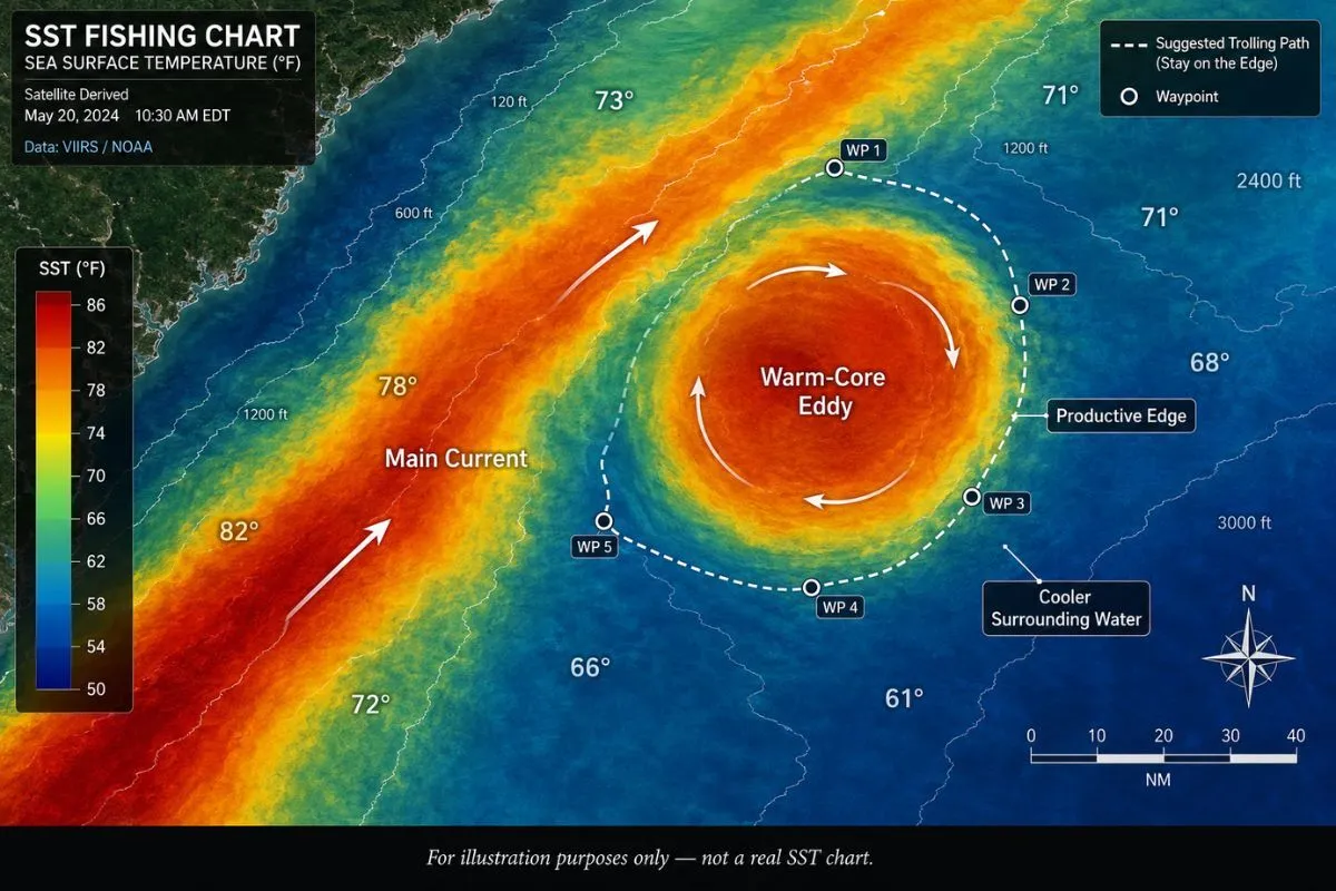
What Do Warm-Core and Cold-Core Eddies Look Like on an SST Chart?
Eddies are one of the most productive features you'll encounter on a satellite image, and one of the most commonly misread. They form when a major current system like the Gulf Stream sheds a rotating mass of water that breaks away and travels independently. That rotating pocket can hold its distinct temperature signature for weeks, even months.
On the chart, a warm-core eddy looks like a circular or oval patch of orange to red, surrounded by cooler greens and blues. It rotates clockwise in the Northern Hemisphere. A cold-core eddy is the inverse: a cooler circular patch surrounded by warmer water, spinning counterclockwise.
How Does an Upwelling Show Up on an SST Chart?
An upwelling appears on a sea surface temperature chart as a patch of cooler water embedded in otherwise warmer surrounding water. It often forms near a coastline, an underwater ridge, or an island where bottom topography forces deeper water upward. The cool color signature signals that cold, nutrient-dense water from depth has risen to the surface.
That process is enormously productive. Cold deepwater carries dissolved nutrients that trigger phytoplankton growth. Phytoplankton feeds the food chain from the bottom up. Upwellings are consistently among the best features you can find on any SST chart, especially when surface temperatures in the upwelling zone overlap with your target species' comfort range.
What Is a Downwelling and Is It Worth Fishing?
Where upwellings pull cold water up, downwellings push warm surface water down. On a chart, they appear as unusually warm patches extending into cooler surrounding water. Downwellings tend to be less biologically productive because the process drives nutrients away from the surface rather than toward it. That said, the edges of downwellings are still boundaries, and boundaries still concentrate fish. If you see a warm anomaly in an otherwise cooler zone, the perimeter of that anomaly is worth a look, even if the center isn't.
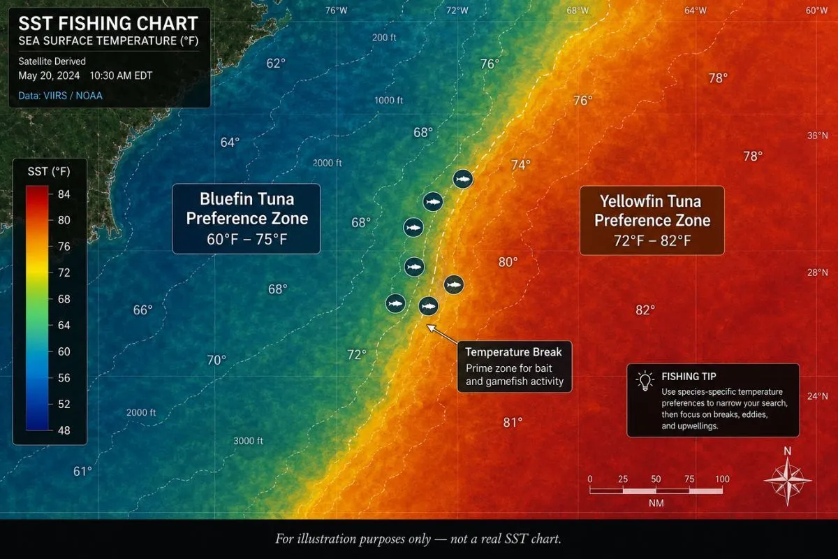
What Water Temperature Do Tuna, Wahoo, and Marlin Prefer?
Sea surface temperature preferences vary by species, and knowing the specific ranges before you start reading a chart makes everything faster and more targeted. That said, these are comfort zones, not hard rules. You'll find fish outside these windows when bait pulls them there, but the ranges below represent where each species is most likely to be concentrated:
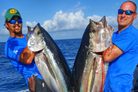
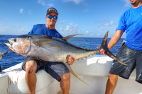
- Yellowfin tuna: 72 to 82°F, often working the warmer side of a temperature break within range
- Bluefin tuna: 60 to 75°F, typically found where cooler, nutrient-rich water converges with warmer currents
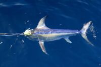
- Wahoo: 65 to 80°F, showing a strong preference for sharp breaks near underwater structure
- Mahi-mahi: 70 to 85°F, concentrating in the warmer portion of that range, especially along weedlines on temperature breaks
- Blue marlin: 73 to 84°F, consistently favoring the warmest water available within the productive range
- Sailfish: 72 to 82°F, frequently found near coastal temperature breaks and active upwelling edges
- Albacore tuna: 60 to 66°F, reliably associated with cooler water upwellings and cold-side edges
Use these ranges to filter your chart before you start looking for features. Eliminate the water that's outside the window for your target species. What's left is your search zone. Then find the breaks, eddies, and upwellings within that zone and prioritize by how sharp and well-defined those features are.
How Do You Layer SST with Chlorophyll, Altimetry, and Current Data?
SST is your starting point, not your finish line. The captains who consistently put fish on the boat are the ones who treat temperature as one layer in a stack, not the whole picture. Each additional data type tells you something the others can't.
What Does a Chlorophyll Map Add to SST Data?
Chlorophyll concentration reveals biological productivity. On a chlorophyll overlay, greens and yellows indicate areas where phytoplankton are actively growing. Blue water is typically low in chlorophyll and low in productivity. When a temperature break on your SST chart aligns with elevated chlorophyll on the overlay, you've found a zone where the physical boundary and the food chain are both active in the same location.
How Does Altimetry Confirm What the SST Chart Is Showing?
Altimetry measures the actual physical height of the ocean surface. Where sea surface height is elevated, warm water is accumulating, typically a warm-core eddy or downwelling. Where height is depressed, cold water is rising: upwelling or cold-core eddy conditions. Overlaying altimetry on your SST chart tells you whether the features you're seeing are physically active or just remnants of older conditions.
What Does Current Data Tell You That SST Doesn't?
Current data tells you where your SST features are going. A temperature break that has been drifting consistently north-northeast at 8 miles per day for the last three days is a break you can project forward. If you know where it was at noon yesterday, you have a reasonable estimate of where it'll be at sunrise tomorrow. That's not guesswork anymore.
How to Use Historical SST Data to Predict Where Fish Will Be
Most SST platforms keep archives going back days, weeks, or years, and that history is something most anglers underuse. Pulling up four or five consecutive days of imagery for your fishing area and flipping through them in sequence lets you watch how features move. You'll see a temperature break shifting direction, an eddy drifting and rotating, an upwelling intensifying or relaxing. Once you see the pattern of movement, you can estimate where things will be tomorrow or the day after with reasonable confidence.
The other powerful use of historical data is seasonal comparison. If you're fishing in June and you pull up June imagery from two and three years ago, you get a sense of what's normal for your region at this time of year. When current conditions look dramatically different from historical patterns, that's worth noting. The Gulf Stream sitting 40 miles further inshore than typical in late spring changes everything about where you'd expect to find fish relative to your usual spots.
Regional SST Patterns: What Changes Depending on Where You Fish
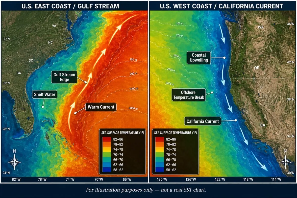
How Does the Gulf Stream Affect East Coast SST Charts?
The Gulf Stream is the defining SST feature for anyone fishing the U.S. East Coast, running northward along the continental shelf edge from South Florida through New England. On the chart, it shows up as a vivid band of orange to red against the cooler greens and blues of shelf water to the west and the Slope Sea to the east.
How Do Gulf of Mexico SST Patterns Differ from the East Coast?
The Gulf of Mexico runs on the Loop Current, an extension of the Caribbean system that enters through the Yucatan Channel, arcs north into the central Gulf, and exits through the Florida Straits. It sheds warm-core eddies that can persist for months, and those eddies are what tournament teams track obsessively when they're fishing the Gulf.
The Mississippi River and other major drainages add a layer of complexity that the East Coast doesn't have. River outflows push cooler, turbid water offshore, creating temperature and clarity boundaries where pelagic species can stage. The edge of that outflow plume against cleaner offshore water is worth noting on your SST chart, particularly for mahi-mahi and cobia.
What Do SST Charts Look Like Along the Pacific Coast?
The California Current runs southward along the West Coast, and upwelling dominates the SST signature, especially in spring and summer. Sustained northwest winds push surface water offshore, drawing cold, nutrient-rich water up from depth. Those upwelling zones show as cool patches near the coast, surrounded by warmer water further offshore.
SST Charts and Thermocline Depth: Reading Below the Surface
Surface temperature doesn't show you the water column, but it gives you useful clues about what's happening below it. A sharp SST break often indicates a well-defined thermocline underneath, where temperature drops steeply with depth. Fish like yellowfin tuna spend their daylight hours just above that layer, where oxygen levels are adequate and baitfish concentrate.
Active upwelling tends to compress the thermocline, pushing it shallower, because cold deepwater is mixing into the upper column. A stable, warm-water zone with little current mixing typically has a deeper, more pronounced thermocline. If you're fishing species that key on the thermocline layer, reading surface temperature patterns gives you a working hypothesis about where that layer sits.
How to Build a Pre-Trip SST Workflow That Actually Works
What Should You Look at the Night Before a Fishing Trip?
The most productive use of SST data happens the evening before you run, not while you're already 40 miles offshore with a boat load of people and a fuel gauge to watch. The night before, you have time to sit with multiple data layers, flip through a few days of recent imagery, and build a real plan.
Start with the most current SST image for your area. Find the major features: where are the temperature breaks? Are there any eddies within range? Any upwellings near structure? Then pull up a 3-day or 5-day composite to fill in any cloud gaps you noticed in the real-time image. Layer in chlorophyll and altimetry to prioritize which features are biologically active. Cross-reference the whole picture with bathymetric charts to find where temperature features align with underwater structure.
How Do You Adapt When SST Conditions Have Shifted Overnight?
A frontal passage can move a temperature break 15 to 20 miles overnight. A shift in current velocity can compress or spread an edge you planned to fish. When you arrive at your target zone and the water doesn't match what you saw on the chart, you need to be able to reason about where things have moved rather than starting the search from scratch.
How to Read Satellite Data for Fishing
Offshore anglers running without satellite data waste fuel searching randomly for oceanographic features that satellite imagery reveals precisely. Thomas Hilton explains what sea surface temperature breaks, chlorophyll concentrations, and altimetry show about fish positioning, how combining multiple data layers identifies high-probability zones, and why real-time updates matter when features shift daily.
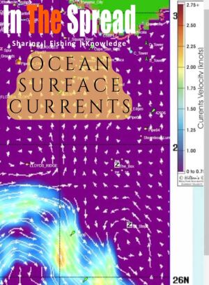
Ocean surface currents concentrate baitfish and gamefish in predictable zones revealed through satellite image analysis. Understanding arrow patterns for current direction and speed, identifying upwelling and downwelling zones where vertical movement affects prey, and recognizing warm core eddies that trap bait transforms random offshore searching into informed decisions about where conditions align to create prime fishing locations.
Moderate chlorophyll concentrations outperform both extremely low and extremely high levels for pelagic fishing because very dense blooms sometimes create conditions predators avoid. Tom Hilton explains interpreting color gradients from blues indicating barren water through greens and yellows showing productive zones, and why combining chlorophyll with temperature and current data identifies where complete food chains support apex predators.
Temperature and chlorophyll satellites show surface conditions but miss the vertical water movements driving productivity. Tom Hilton explains how altimetry reveals upwelling bringing nutrients from depth versus downwelling pulling them away, why upwelling edges outperform centers for predator positioning, and what sea surface height variations indicate about food chain sustainability.
Debate over salinity chart utility stems from satellite showing only surface conditions while many species position at depth. Learn what purple to maroon color transitions reveal about freshwater and saltwater mixing zones, why king mackerel concentrate along these gradients, and when nearshore applications work better than offshore tuna scenarios.
Blue marlin preferring 78 to 88 degrees differs from wahoo favoring cooler break edges, making species-specific SST interpretation critical. Learn identifying temperature gradients where water masses collide, why breaks without chlorophyll may hold no fish despite perfect temps, and how daily shifts mean yesterday's productive water may be miles from current locations.
Frequently Asked Questions: Reading SST Charts for Offshore Fishing
What is a sea surface temperature chart and how is it used for fishing?
An SST chart is a satellite-derived, color-coded map showing the temperature of the ocean's surface layer. Offshore anglers use it to identify temperature breaks, warm-core and cold-core eddies, upwellings, and convergence zones that concentrate baitfish and predators. By overlaying those features with species-specific temperature preferences, you can plan routes to high-probability fishing zones before you leave the dock.
What is a temperature break and why does it attract gamefish?
A temperature break is a zone where ocean temperature changes sharply over a short distance, marking the collision boundary between two different water masses. Those boundaries concentrate nutrients and baitfish because current interaction at the edge creates productive mixing conditions. Predatory species including tuna, wahoo, marlin, and mahi-mahi actively patrol these edges.
How much of a temperature difference makes a fishing break worth targeting?
A change of 1 to 2 degrees Fahrenheit over a short distance can influence fish behavior and positioning. Breaks of 3 to 5 degrees typically produce well-defined fronts that consistently concentrate bait and gamefish. As a general rule, the steeper the color transition on the chart, the sharper the physical boundary in the water and the more productive the edge tends to be.
What do warm-core and cold-core eddies look like on an SST chart?
Warm-core eddies appear as circular patches of warm water, orange or red on most platforms, surrounded by cooler water. Cold-core eddies show as circular cool patches surrounded by warmer water. Both concentrate fish along their edges rather than their centers. The outer boundary of the eddy is where current interaction and bait concentration are highest.
What is an upwelling and why does it produce good fishing?
An upwelling appears on an SST chart as a patch of cooler water embedded in warmer surrounding water. It indicates cold, nutrient-rich water rising from depth to the surface. Upwellings trigger phytoplankton growth that builds the food chain from the bottom up, making them among the most biologically productive features on any satellite image.
What water temperature do yellowfin tuna prefer?
Yellowfin tuna are most consistently found in water between 72 and 82°F. They often concentrate along temperature breaks within that range, particularly where the warmer side of the break coincides with elevated chlorophyll concentrations or visible surface bait activity.
Why do clouds cause gaps in SST chart data?
Infrared satellite sensors, which produce the highest-resolution SST imagery, cannot see through cloud cover. Areas under clouds show as data voids or get filled with older composite readings. Multi-day composite images address this by combining several days of satellite passes to fill the gaps, giving a complete picture at the cost of some real-time precision.
How often should you check SST charts before a fishing trip?
Review current SST data the evening before your trip, and compare at least three to five days of recent imagery to track how features have been moving. Download charts for offline use before you run offshore. For tournament fishing or multi-day runs, monitoring conditions for several days in advance helps you distinguish between stable, persistent features and rapidly shifting conditions.
What is the most effective way to combine SST data with other satellite tools?
Overlay SST with chlorophyll data to confirm that temperature breaks are biologically active, altimetry to verify upwelling and eddy structure independently, and current data to understand how features are moving. A location where all three data layers point at the same feature is your highest-confidence target.
Reading the Ocean Beats Covering Miles
The captains who find fish consistently aren't running more miles. They're running smarter ones, because they spent the night before studying what the ocean was doing while everyone else was sleeping. SST charts are a fundamental part of that process.
That's not magic. It's pattern recognition, and it gets faster the more you do it. Every trip you study the charts before and debrief against them after, you're building a mental library of how your local ocean behaves across seasons, conditions, and species. Eventually you stop seeing a map of colors and start reading a map of fish.
Login
to leave a review.
User Reviews
There are no reviews yet.
Complete Dredge Pulley Setup Guide
Saltwater
12.28.2020
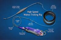
High Speed Wahoo Trolling Rig
Saltwater
09.08.2018
Fishing Light Tackle for Yellowfin Tuna
Saltwater
09.08.2018

Fishing Gulf of Mexico Inshore Waters
Saltwater
11.28.2023
0