Satellite fishing maps give offshore anglers a real-time picture of ocean conditions before leaving the dock. Learning to read SST charts, chlorophyll data, altimetry, and current edges, and knowing how to layer them together, is one of the highest-leverage pre-trip skills a serious offshore angler can develop.
Using Satellite Fishing Maps Before You Head Offshore
Offshore fishing used to be educated guesswork. You ran to known structure, watched the color change, and hoped the bait was stacked where you expected it. Today, serious captains and tournament competitors are pulling up satellite data the night before they leave the dock, and they are finding fish that everyone else is burning fuel to locate by trial and error.
Satellite fishing maps have fundamentally changed how experienced anglers plan offshore trips. This is not about technology for its own sake. It is about understanding what the ocean is actually doing on any given day and putting your baits in the water where fish are most likely to be feeding. Knowing how to read and interpret these charts is now as essential a skill as rigging a bait or reading a depth finder.
What Is a Satellite Fishing Map?
A satellite fishing map is a visual dataset collected by orbiting satellites that measures ocean conditions from above. Unlike traditional nautical charts that show fixed depth and bottom structure, satellite maps are dynamic. They update regularly, some as often as daily, and they show you the current state of the water column in terms of temperature, biological productivity, current movement, and sea surface height.
What makes satellite maps valuable for fishing is what they reveal about ocean dynamics that you simply cannot see from a boat. A temperature break might extend 40 miles offshore with a color change sharp enough to step across. A subsurface eddy might be pushing bait and predators to the surface 15 miles off the shelf edge. Without satellite data, finding those zones takes time, fuel, and luck. With it, you are making informed decisions before the lines go in.
Why Do Satellite Maps Give Offshore Anglers an Edge?
The offshore environment is not static. Water masses shift, eddies spin off the Gulf Stream, upwellings push cold nutrient-rich water toward the surface, and thermoclines rise and fall with the seasons. Fish respond to all of it. They follow bait, and bait follows the biological and thermal conditions that satellite instruments measure.
The captains who consistently produce are not just lucky. They are reading the ocean systematically before they leave the dock, and they adjust their starting waypoints based on what the data shows, not where they went last week.
What Are the Primary Satellite Data Layers?
How Do SST Charts Help You Find Fish?
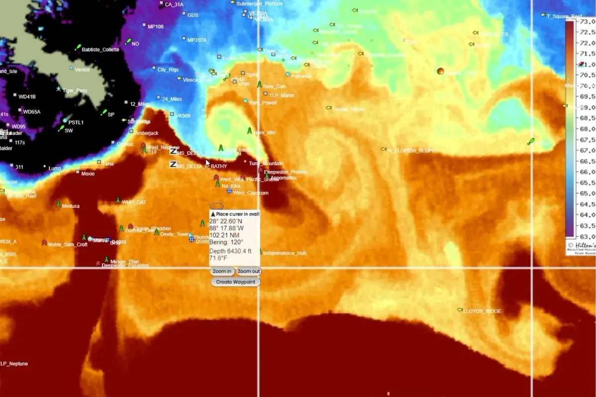
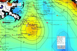
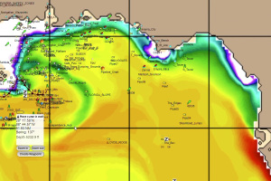
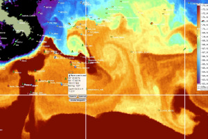
Sea surface temperature is the most widely used satellite fishing data layer for a straightforward reason: fish are thermal creatures. Every species has a preferred temperature range, and when the water falls outside that range, they move. SST charts give you a real-time thermal map of the ocean surface, color-coded by temperature across the entire area you plan to fish.
The most productive fishing almost always happens at temperature breaks, the zones where two water masses of different temperatures converge. These edges concentrate bait, and where bait concentrates, predators follow. A hard break of three to five degrees over a short horizontal distance is typically far more productive than a gradual gradient spread over many miles.
- Look for the sharpest gradient in color, not just the warmest water on the chart
- Pay attention to the shape of the break; curved or looping edges often indicate active eddy movement
- Compare the current chart with charts from the previous two or three days to see if the feature is holding position or migrating
- Warmer is not always better; match the target temperature range to your species and season
If you want to go deeper on chart interpretation mechanics, the In The Spread blog has a dedicated breakdown on how to read SST charts for fishing that walks through color scales, gradient identification, and composite image timing in practical terms.
For a closer look at how Hilton's visual tools display SST data for pre-trip planning, see Hilton's Offshore Satellite Fishing Maps.
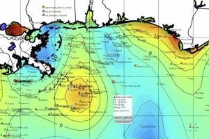
What Do Chlorophyll Charts Tell You About Productive Water?
Chlorophyll concentration maps show biological productivity in the water column. High chlorophyll areas, shown in green and yellow tones on most platforms, indicate phytoplankton blooms. That bloom supports zooplankton, which supports baitfish, which supports the pelagic predators you are targeting.
The most productive zone is rarely deep inside the blue water itself. It is the transition zone at the edge of the green water, where bait is concentrated and active predators are moving through looking for a meal. Clean blue water with zero chlorophyll can actually be a biological desert despite looking beautiful.
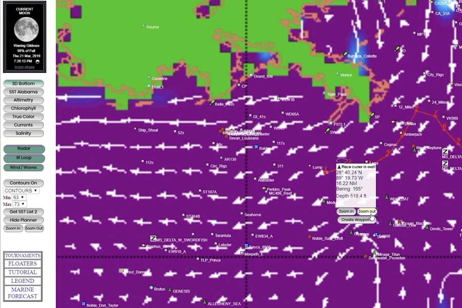
How Does Altimetry Help You Read Offshore Currents?
Altimetry data measures the physical height of the ocean surface using radar from orbit. Warm core eddies, which spin clockwise in the Northern Hemisphere and hold warmer blue water, create elevated sea surface height readings. Cold core eddies spin counterclockwise and depress the surface, pulling cold, nutrient-rich water upward. For a foundational look at how altimetry works as a fishing tool, see Altimetry Fishing Satellite Maps on the In The Spread blog.
What Are Current Edges and Why Do They Matter?
Current edges form where adjacent water masses of different densities move past one another. These boundaries create convergence zones that concentrate bait. They are often, but not always, visible as temperature or color breaks on satellite maps. Sometimes they show up more clearly in altimetry or modeled current layers than in SST or chlorophyll.
What Secondary Data Layers Should Offshore Anglers Know?
Not every satellite fishing platform packages these data layers the same way, and the differences between services matter depending on your region and target species. For a side-by-side breakdown of what each platform delivers, see Comparing Satellite Mapping Services for Offshore Fishing.
Does Salinity and Water Clarity Affect Where Fish Hold?
Salinity affects water density, and density differences are a primary driver of current edge formation and stratification in the water column. While direct salinity charts are less commonly integrated into consumer fishing platforms than SST or chlorophyll, understanding salinity dynamics helps explain why some edges hold bait and others do not.
Water clarity, approximated through turbidity and color data from ocean color satellites, tells you how far light penetrates. In clear blue offshore water, productive zones can extend deeper. In turbid green water, bait and the fish feeding on it tend to stay closer to the surface.
How Do Wind and Sea State Overlays Factor Into Trip Planning?
Wind and sea state data is not strictly satellite-derived, but modern satellite fishing platforms incorporate it alongside ocean data layers. Knowing wind direction and speed overlaid on your SST and chlorophyll charts lets you anticipate where wind-driven surface convergences will form and how sea conditions will affect your trolling presentation.
Wind-driven upwellings are a prime example. Sustained offshore winds push surface water away from the coast, causing cold, nutrient-rich bottom water to rise and replace it. SST charts will often show this as a cold water intrusion along the coast that warms progressively offshore, creating productive transition zones that reward anglers who recognize them. The In The Spread blog covers upwelling and altimetry maps for sport fishing in detail, including how to use these features together before a trip.
What Does Bathymetry Add to Your Offshore Strategy?
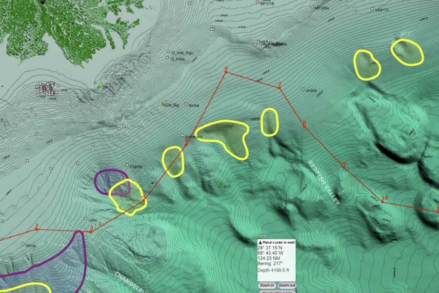
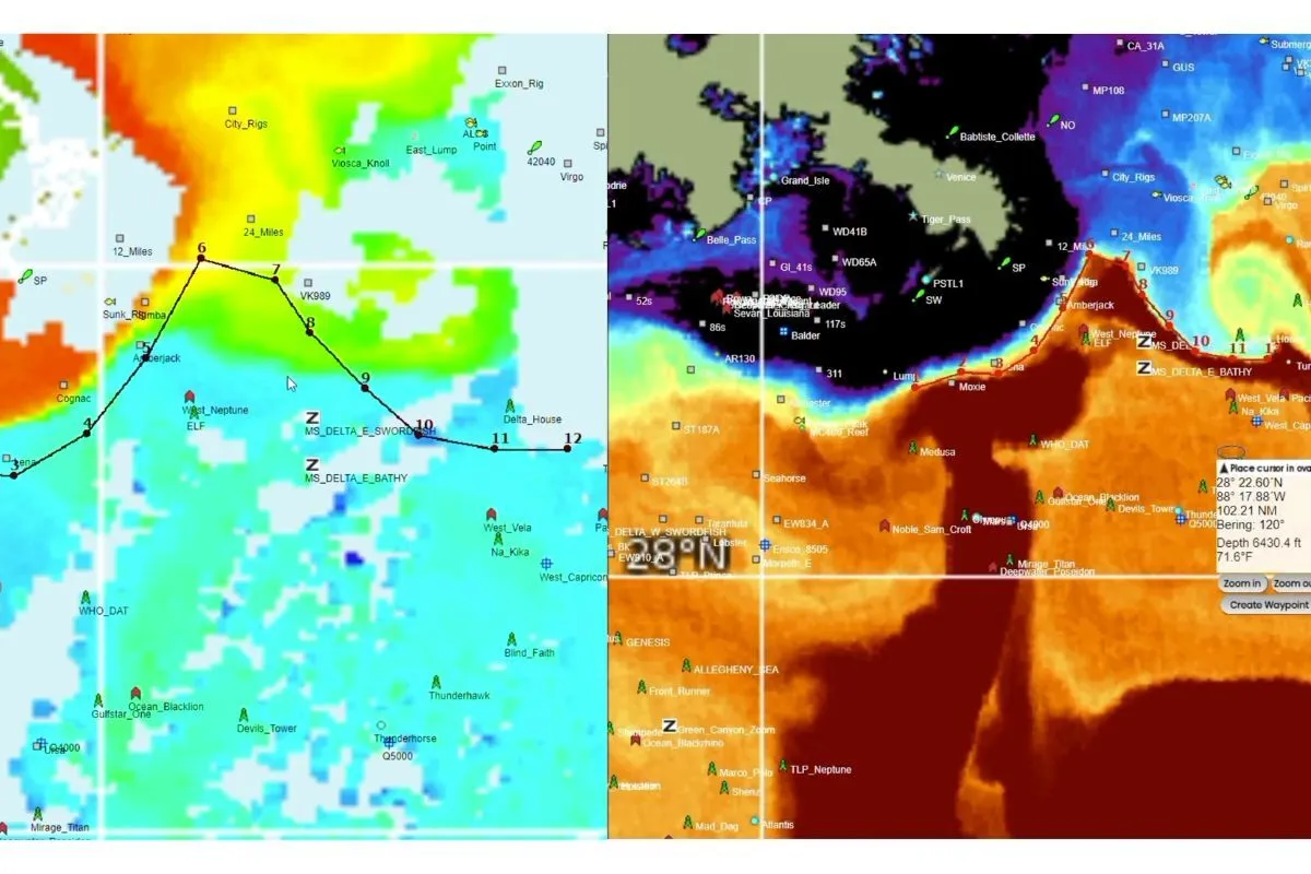
Bathymetry is fixed structure data showing ocean floor depth contours, including shelf edges, submarine canyons, seamounts, and hard bottom ridges. It does not change day to day, but its interaction with dynamic satellite layers is critical. Current edges and thermal breaks that align with bottom structure are almost always more productive than features occurring over featureless flat bottom.
How Do You Read and Layer Satellite Data Effectively?
The anglers who get the most out of satellite fishing maps are not looking at one layer in isolation. They build a picture from multiple data sources and look for where the layers agree.
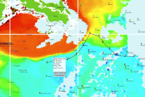
Start with SST. Find the most defined temperature break within a reasonable running distance. Then pull up the chlorophyll chart and check whether that break corresponds with a productive edge between green and blue water. Check the altimetry to understand the eddy or current structure driving that break. Finally, overlay bathymetry to confirm whether the feature is sitting over productive structure.
When all four layers point to the same geographic location, you have high confidence. When they are scattered or contradictory, you are looking at a more complex oceanographic situation that may require checking data from multiple satellite passes before committing to a starting waypoint.
- Start with SST to identify the primary temperature break within range
- Confirm biological productivity with chlorophyll at that same location
- Check altimetry to understand which current dynamics are generating the feature
- Overlay bathymetry to assess whether structure reinforces the surface conditions
- Add wind and sea state data to anticipate drift direction and refine your trolling presentation
This is exactly the decision-making process that working offshore captains apply every time they sit down with their charts before a trip. For a practical breakdown of how altimetry specifically improves offshore fishing outcomes, see How Altimetry Improves Offshore Fishing.
How Do Satellite Maps Apply to Specific Species?
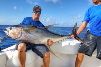
Where Do Tuna Stack Up on Satellite Charts?
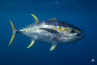
Yellowfin tuna are textbook temperature‑break fish, but they still work a fairly broad warm band rather than a single magic number. They tend to stack along hard SST and color fronts in roughly the upper‑60s to upper‑70s, with the “sweet spot” sliding seasonally and by region, especially where those breaks intersect structure or current edges. Bluefin tuna, especially in winter and spring, are more comfortable in cooler water and often set up along complex eddy and shelfbreak interfaces where slightly cooler temps, strong gradients, and dense baitfish schools come together. For a deeper dive into reading these features for tuna and other pelagics, the In The Spread piece Fishing Temperature Charts walks through practical examples of how to apply SST charts on the water.
Chlorophyll charts are especially useful for tuna because they trace productivity and, by extension, bait. Skipjack, small tunas, flying fish, and squid frequently load up along the transition between cleaner blue and more productive green water, where moderate chlorophyll and a defined edge signal a strong food chain rather than just green sludge or sterile blue. That blue‑green interface—when it lines up with the right temperature and structure—is where your tuna are most likely to be actively hunting.
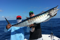
What Satellite Data Matters Most for Wahoo Fishing?
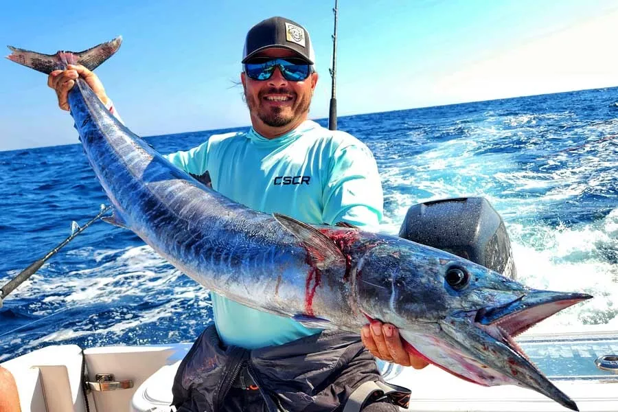
Wahoo are one of the more temperature‑driven blue‑water targets, but they still use a fairly broad warm‑water band. They favor clean, blue water in roughly the low‑70s to upper‑70s, with sharp temperature breaks and structure edges producing most consistently. Because the best bites often cluster around specific breaks inside that broader envelope, precise SST chart reading becomes a major advantage when you are specifically hunting wahoo rather than just trolling for “whatever bites.”
Captain Mike Dupree shows exactly how he bakes this into his program in his In The Spread course, Wahoo Slow Trolling with Mike Dupree. He uses satellite data to pinpoint the most promising temperature and current edges, then adjusts where he positions his spread and how fast he trolls based on what that SST picture is telling him.
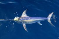
How Do Marlin and Sailfish Use Offshore Oceanographic Features?
Blue marlin and white marlin are wide‑ranging open‑ocean predators, but they are far from random in how they use that space. They concentrate along current edges, at the intersections of mesoscale eddies, and in zones where SST features line up with subsurface bait concentrations. Altimetry is especially useful for marlin because it reveals the position and structure of eddies and convergence zones, which frequently serve as high‑probability habitat for big blues when they overlap suitable temperatures and forage.
Can Satellite Maps Help with Nearshore Species Like King Mackerel?
King mackerel and other nearshore pelagics consistently respond to water‑quality gradients that modern satellite SST and chlorophyll products can resolve at a useful scale. During the summer along the Southeast U.S. coast, kings often concentrate around the inner edge of Gulf Stream water, as warm, blue intrusions and spin‑off eddies push closer to the shelf and intersect nearshore structure. SST charts help you see when that warm tongue or break slides shoreward, and how close the most productive temperature edge has moved to accessible depths—for example, when the 72‑ to 75‑degree band pins against 60–90 ft ledges. Chlorophyll maps then highlight where greener, more productive water meets that cleaner blue edge, making it easier to target the blue‑green transition where bait often stacks and kings feed most actively. Although satellite resolution degrades and noise increases in the immediate coastal zone, these broad gradients still provide directional intel that is highly actionable for planning which sector of the coast, depth band, and edge to work on a given day.
Can You Use Satellite Fishing Maps on Your Phone?
Yes, and for many captains the phone or tablet has become the primary display for satellite data review. Most modern satellite fishing services offer mobile-optimized interfaces or dedicated apps that allow you to pull up and layer SST, chlorophyll, altimetry, and current data on a touchscreen before and during a trip.
The practical advice is to download or cache your charts before you leave the dock. Offshore cellular coverage is unreliable beyond 20 to 30 miles depending on your location, and LTE signal drops off faster than most anglers expect. Pre-loading the morning's satellite data while you still have connectivity lets you reference it at any point during the run without depending on a signal.
Offshore Strategy and Satellite Fishing Course
Frequently Asked Questions About Satellite Fishing Maps
What is a satellite fishing map?
A satellite fishing map is a real-time visual dataset collected by orbiting satellites that shows ocean conditions including surface temperature, biological productivity, current movement, and sea surface height. Anglers use these maps to identify temperature breaks, productive bait zones, and current edges before heading offshore, turning pre-trip planning into a data-driven process rather than guesswork.
How do SST charts help with fishing?
Sea surface temperature charts show where different water masses converge, creating thermal edges that concentrate bait and the predators that feed on them. Finding a hard temperature break with a shift of three degrees or more over a short distance is one of the most reliable starting points for locating open water pelagics including tuna, wahoo, marlin, and sailfish.
What is the difference between altimetry and chlorophyll for fishing?
Chlorophyll charts show biological productivity, reflecting where phytoplankton blooms and bait concentrations are most likely to occur. Altimetry measures ocean surface height to reveal the position and spin direction of eddies and current systems beneath the surface. They work best in combination: chlorophyll tells you where the bait is, and altimetry tells you why it is there and how stable that feature is likely to be over the next few days.
Which satellite fishing service is best for offshore anglers?
The best service depends on your region, target species, and how much data interpretation you want integrated into the interface. For a detailed breakdown of available satellite fishing services and what each one delivers, visit the satellite mapping services comparison article on the In The Spread blog.
Reading the Ocean Before You Leave the Dock
Learning to read satellite fishing maps well is a skill that compounds over time. The more trips you correlate with pre-trip satellite data, the faster you develop an intuition for what the charts are telling you and how the oceanographic patterns in your region actually behave across seasons.
Start simple. Pull up an SST chart and a chlorophyll chart the morning before you run. Identify the most defined break within a practical running distance. Note where the color boundary aligns with the temperature gradient. Mark a starting waypoint at the intersection of those two features and see what you find. Over time, layer in altimetry and bathymetry and start cross-referencing your catch results with the chart conditions recorded for those days.
Login
to leave a review.
User Reviews

Benjamin
11.12.2024
0

Robert
11.12.2024
0
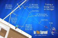
Complete Dredge Pulley Setup Guide
Saltwater
12.28.2020
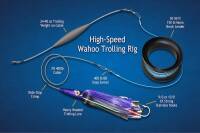
High Speed Wahoo Trolling Rig
Saltwater
09.08.2018

Fishing Gulf of Mexico Inshore Waters
Saltwater
11.28.2023
0